Far Cry 6
Game Page
Overview
Far Cry 6 is an open-world first-person shooter set on the fictional Caribbean island of Yara, ruled by a ruthless dictator named Anton Castillo. Players take on the role of a guerrilla fighter named Dani Rojas, joining a revolution to overthrow Castillo's regime and liberate the island.
As my first project in game development, this project holds a special place in my heart. I dedicated slightly over a year to this project, focusing primarily on tutorials, HUD, and game interaction systems. In line with the collaborative nature of UX, I regularly engaged with various departments in order to develop my designs.
UX Designer @ Ubisoft
2019-2020
FOCUS
TOOLS
I've selected some highlights to present here, but these constitute only a portion of my overall contributions to the project. Each design snippet shown is the result of thorough analysis and many rounds of iterative refinement.
Tutorial System
Principles
-
Relevance: Show the player what they need, when they need it, and no other time.
-
Avoid Repetition: Don't teach players something they've already done.
-
Player Control: Allow players to opt into tutorials when they want to. Avoid suddenly blocking the player from gameplay.
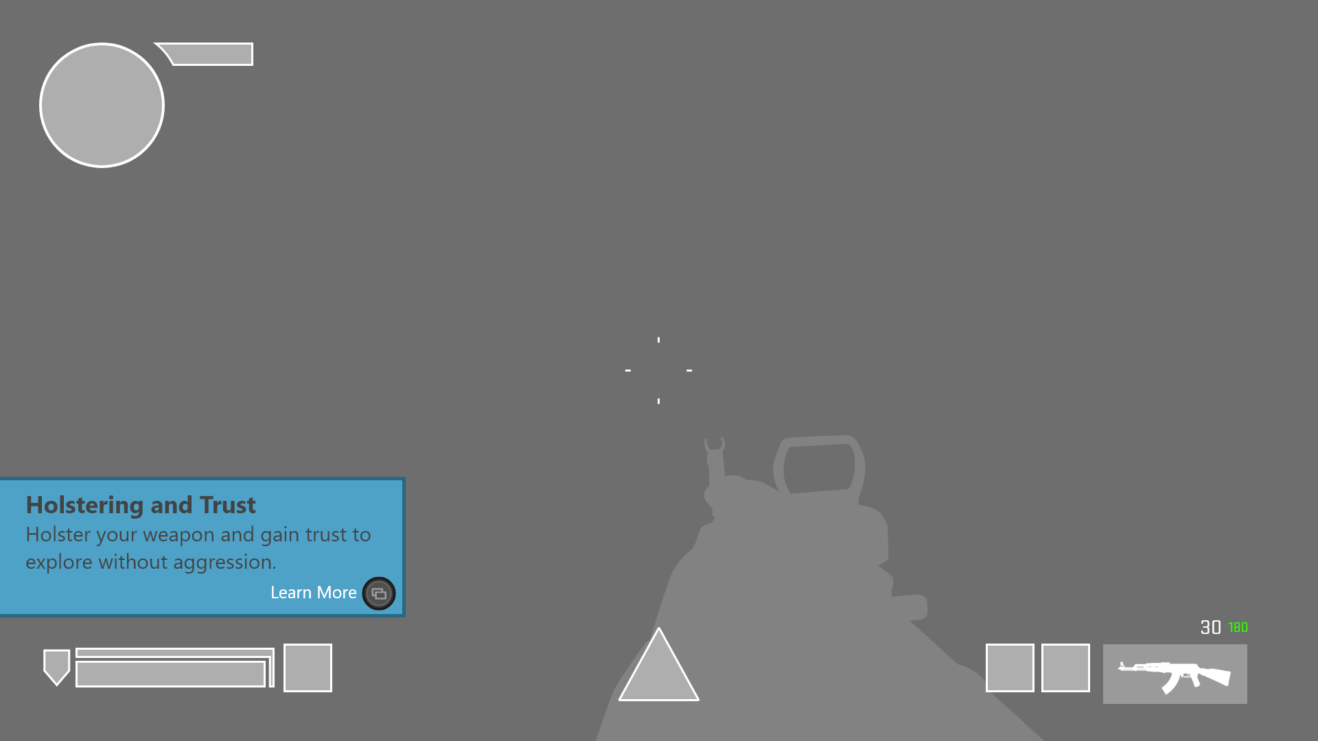
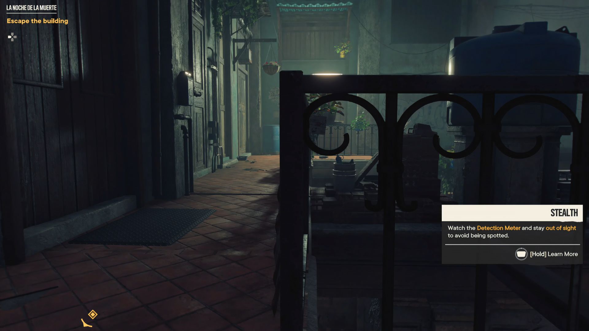
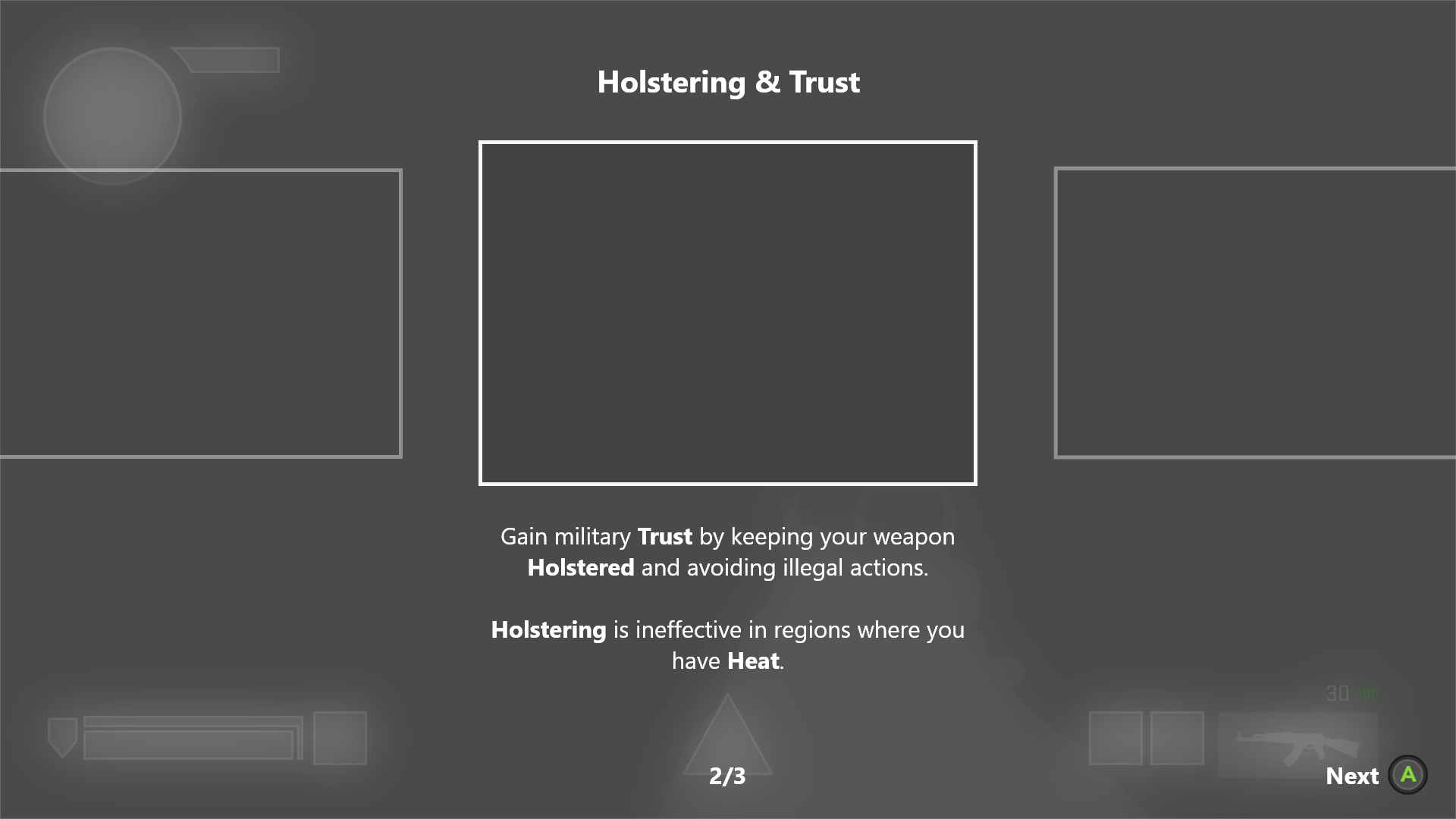
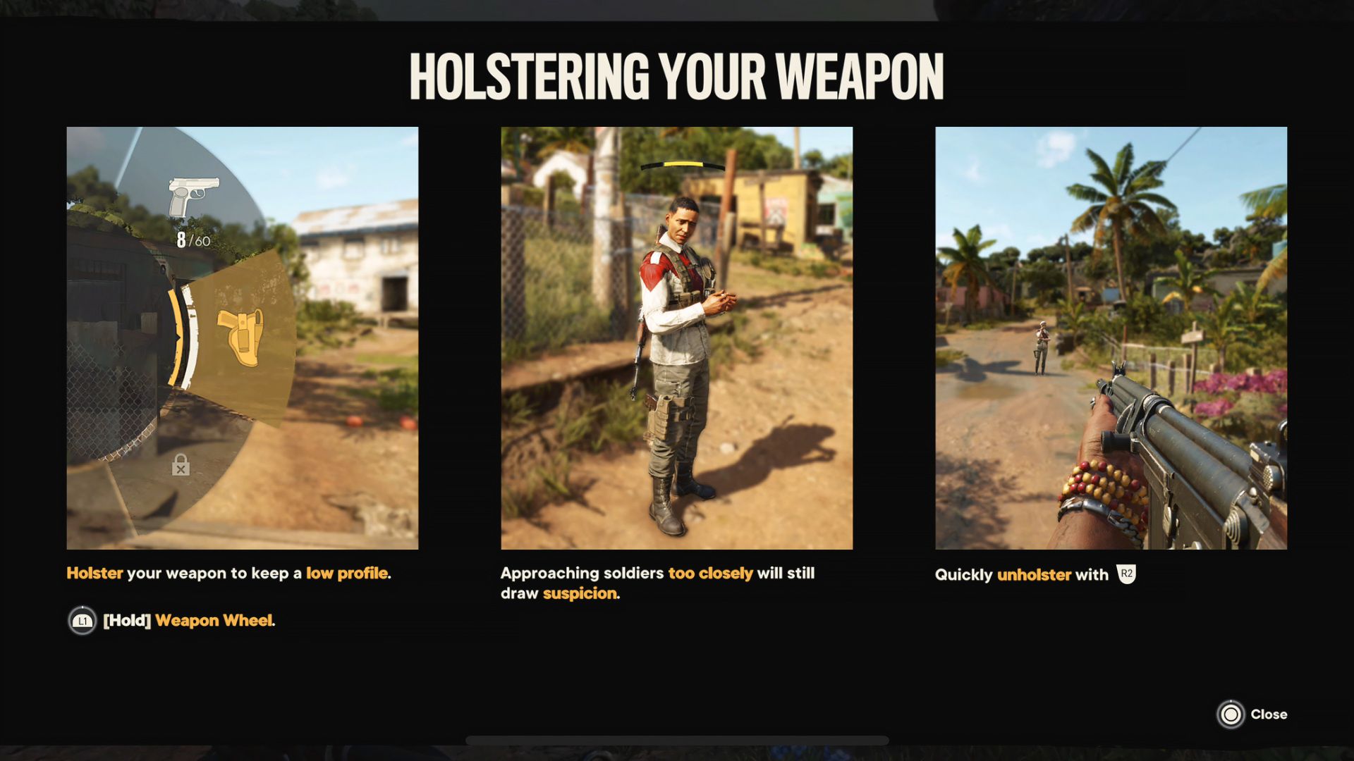
Different tutorial types can be chained in a sequence to provide a dynamic tutorial
experience without overwhelming the player.
Tutorial types include:
- Pop-ins: A pop-in window with a brief message or an NPC audio message.
- Opt-ins: A small slide-in window that presents a title, a short description, and a button prompt. This can lead to full takeover tutorials, menu tutorials, or menu pages.
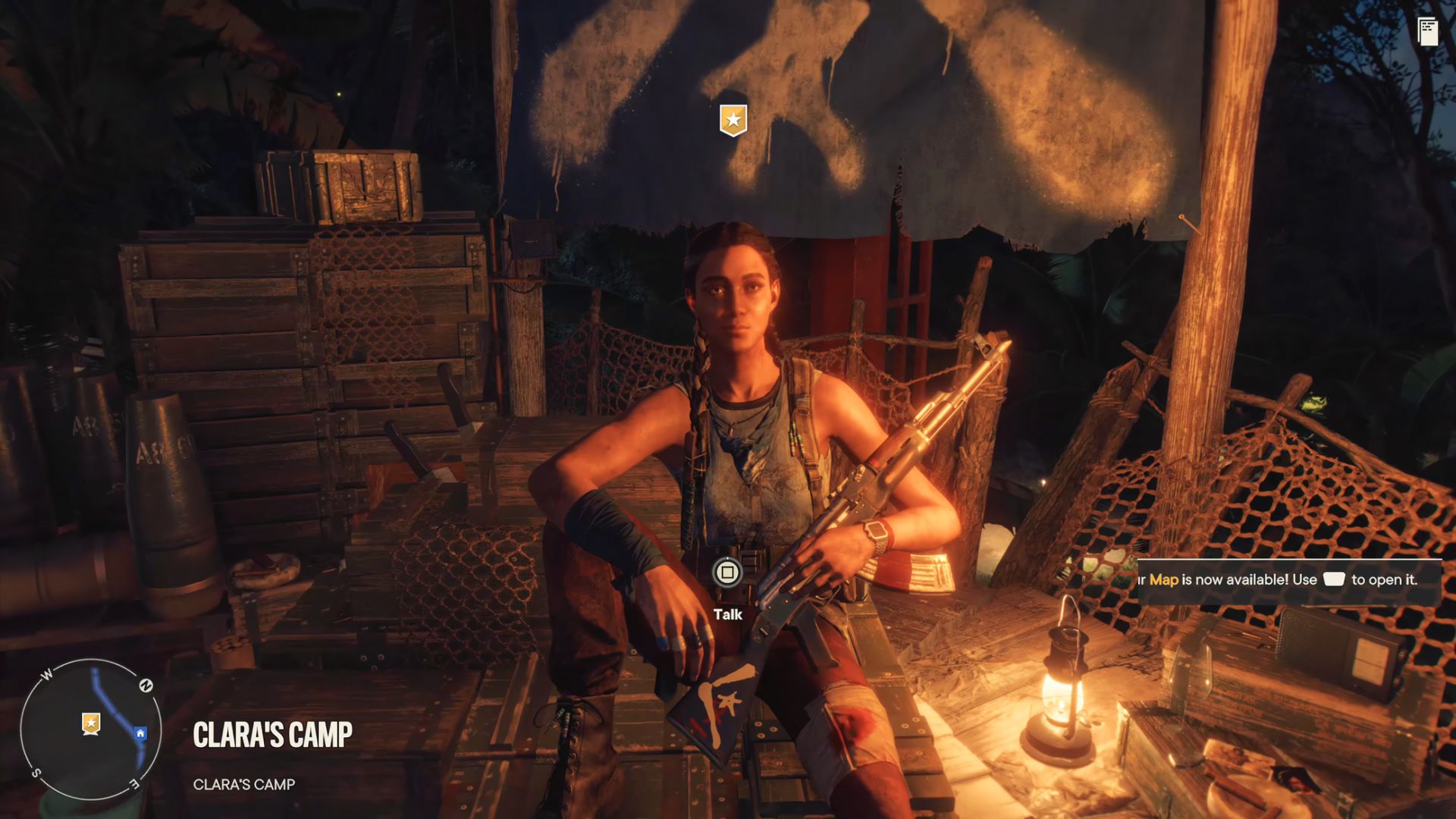
- Interaction prompts A prompt that appears when the player is within interaction range to an object or point.
- Control stacks A stack of controls that appear when the player is in a vehicle or has multiple prompt actions available.
Note: My initial design aimed to avoid the fullscreen paneled tutorial style from FarCry5. I proposed presenting one panel at a time, allowing players to focus on each element separately. This approach changed after I moved to a different project.
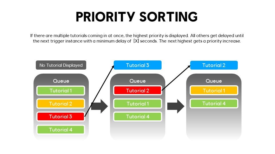
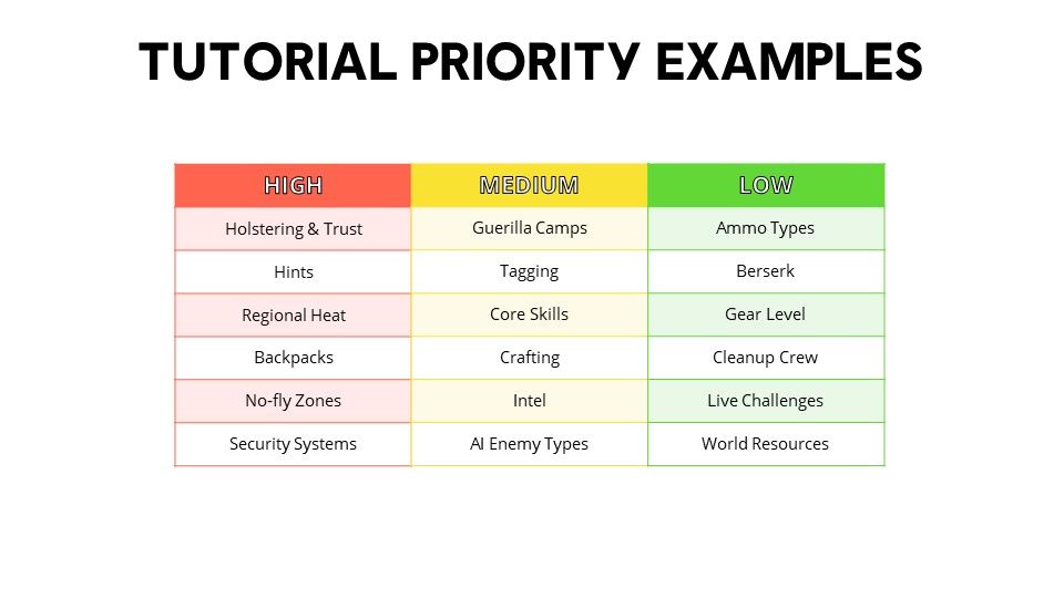
Priority
Documentation
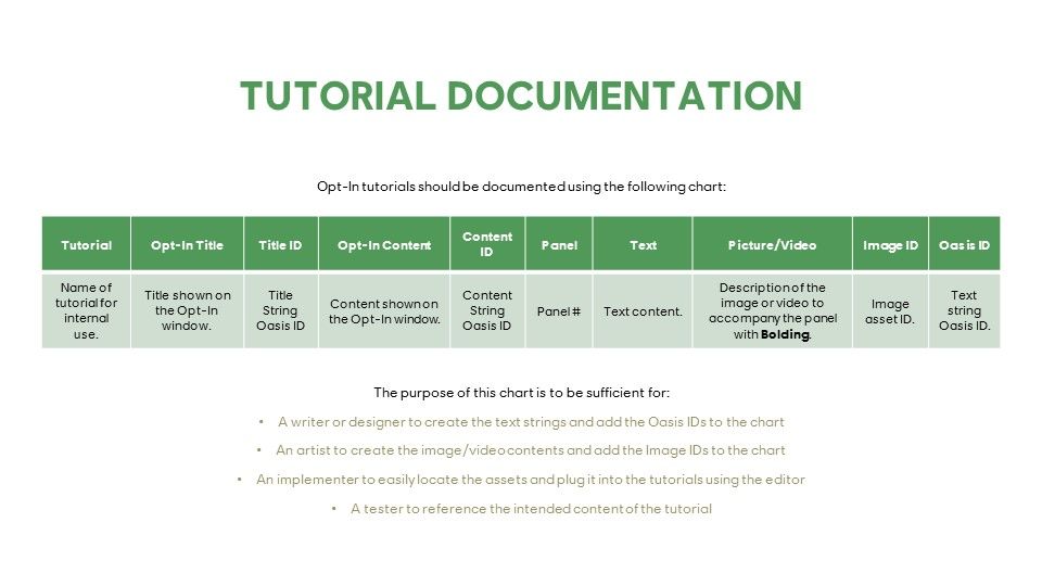
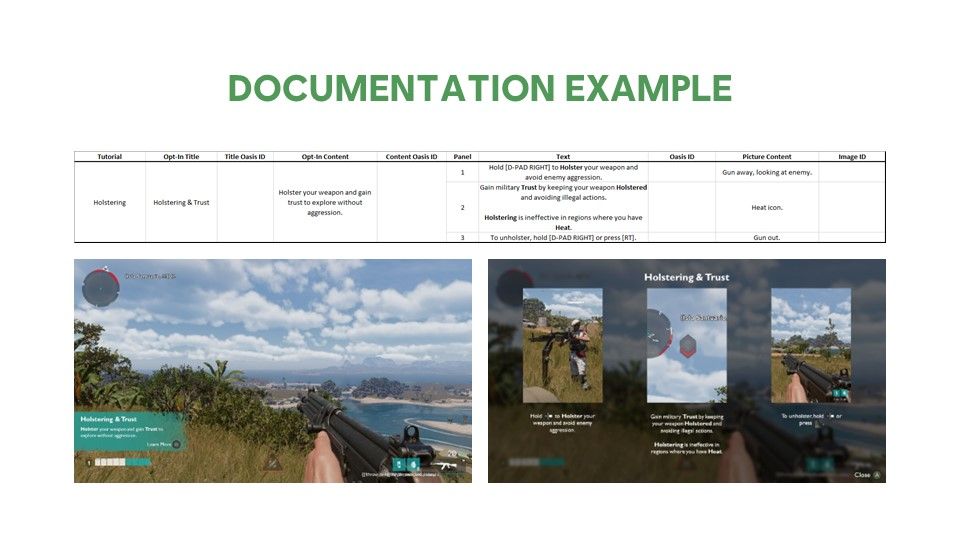
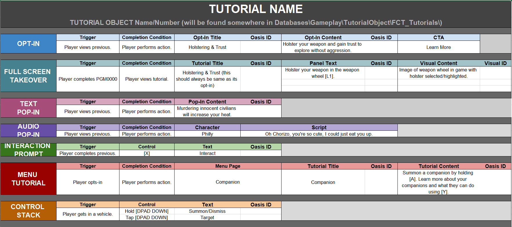
Note: I took charge of crafting content for all in-game tutorials. To streamline this process, I:
- Organized everything in a spreadsheet for easy implementation and updating
- Wrote all text strings in Oasis
- Provided detailed descriptions to aid localization efforts
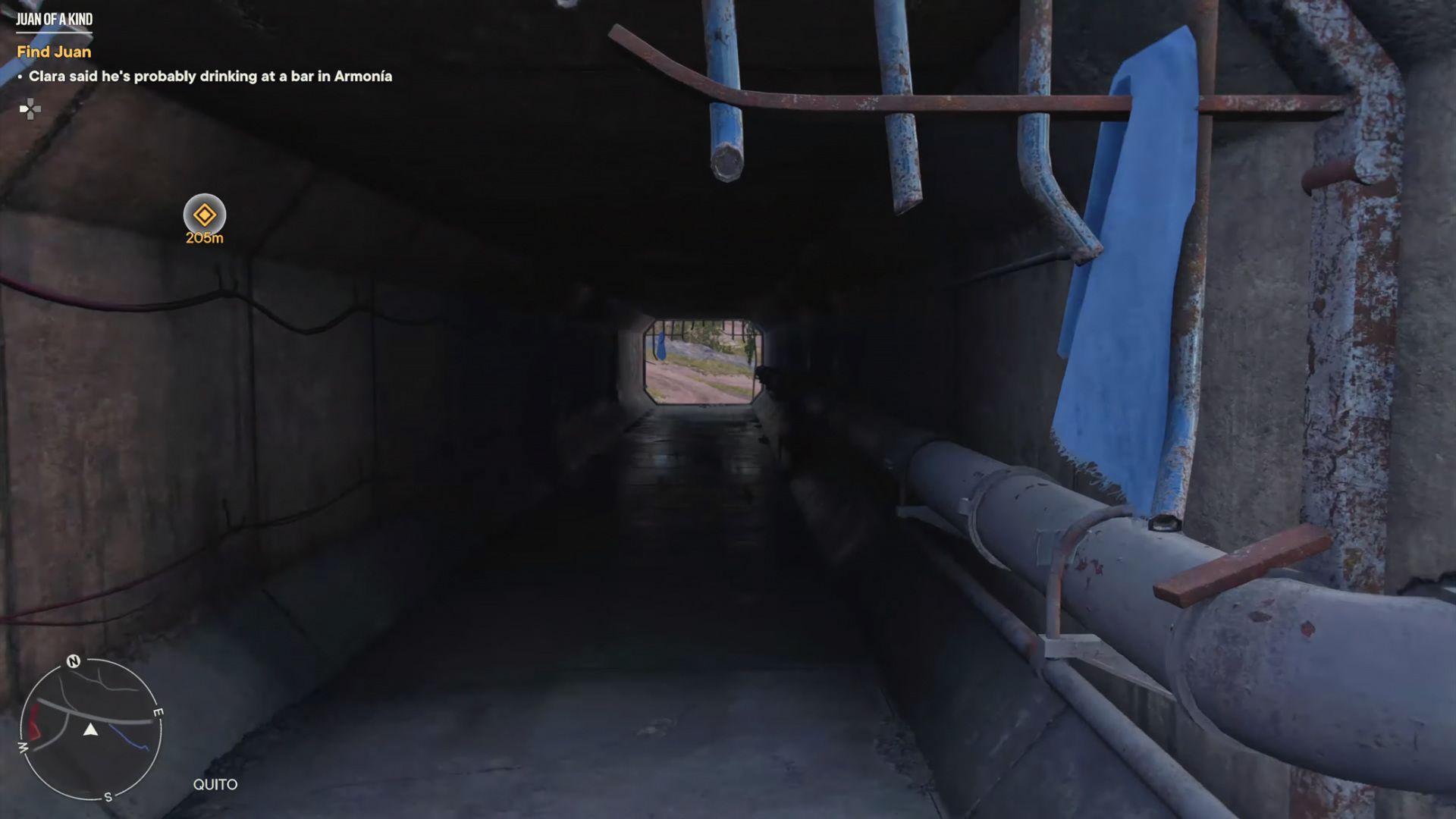
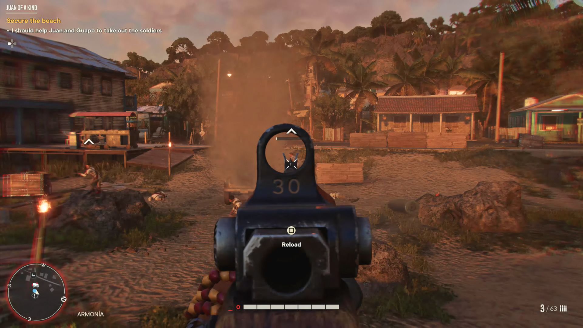
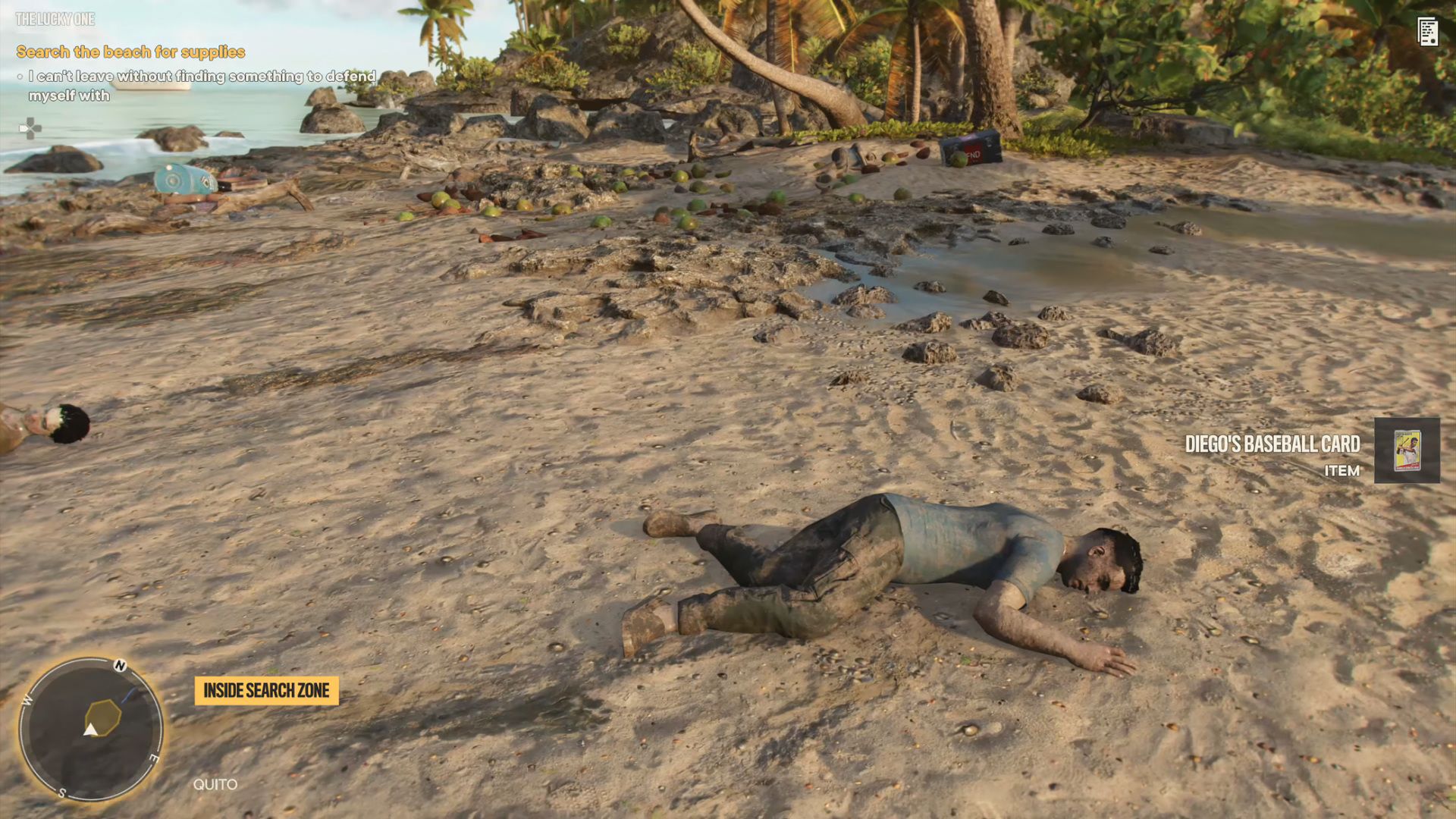
Minimap
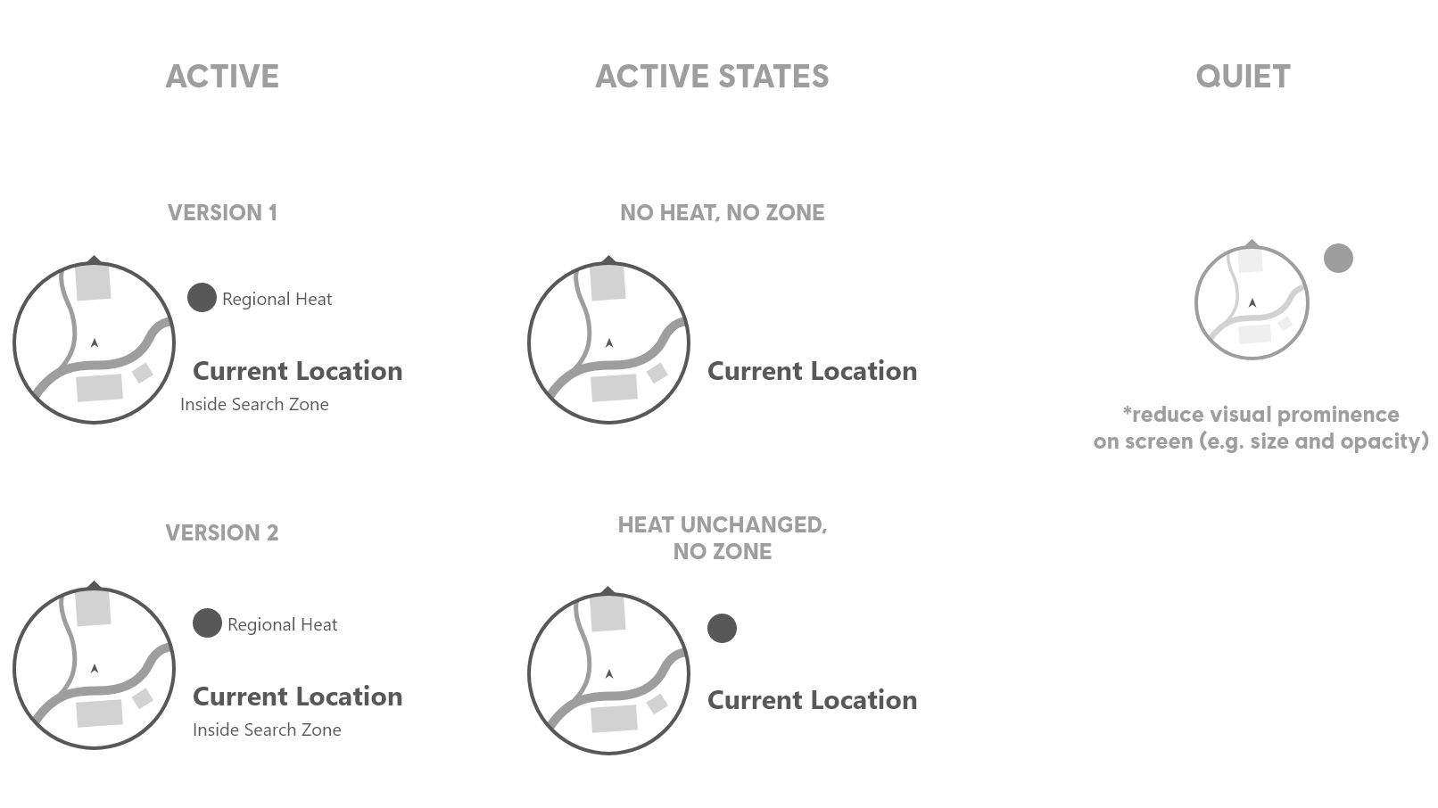
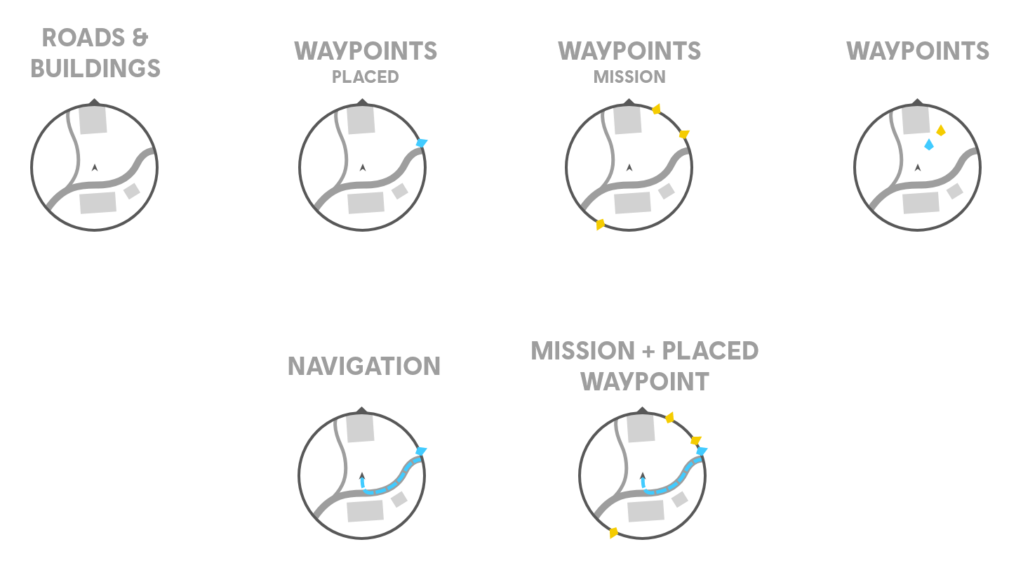
Map Elements
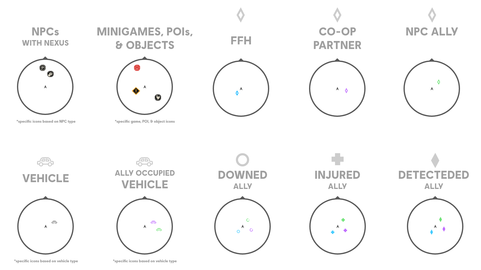
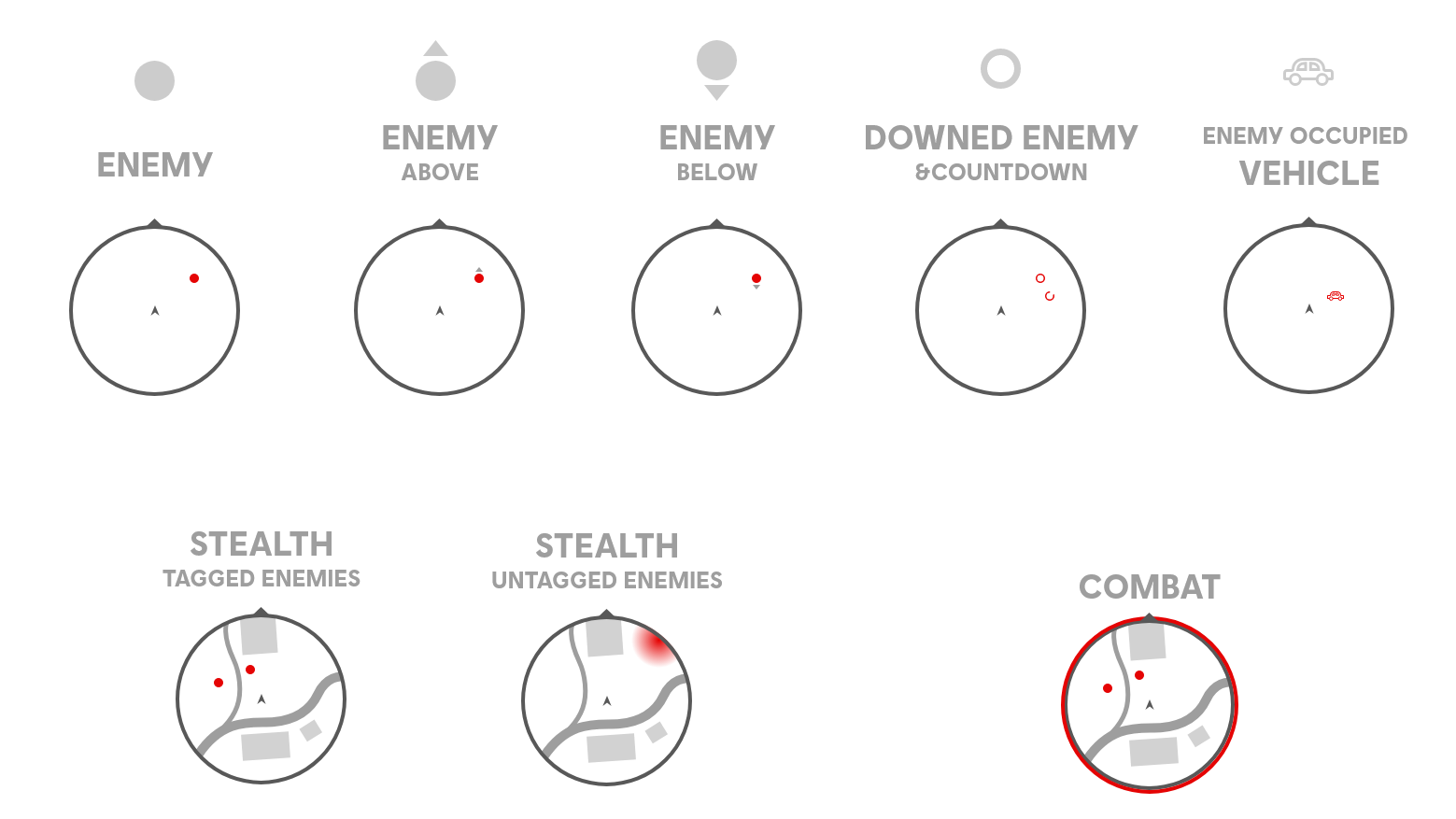
Allies and Enemies
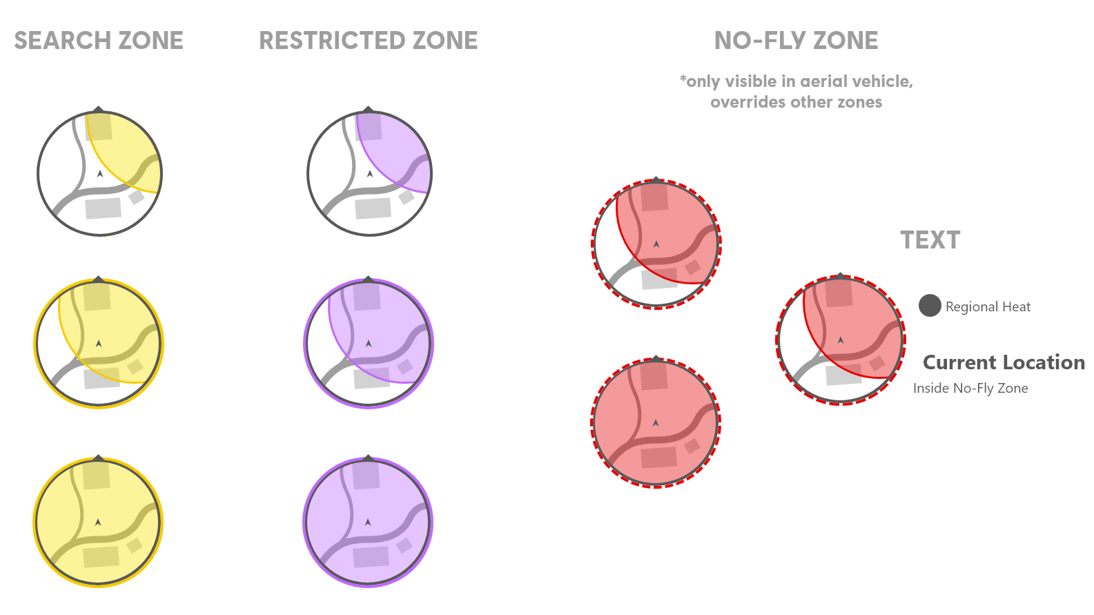
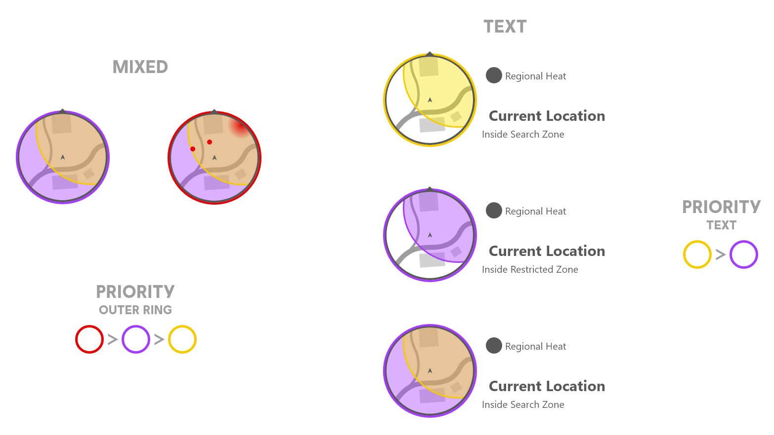
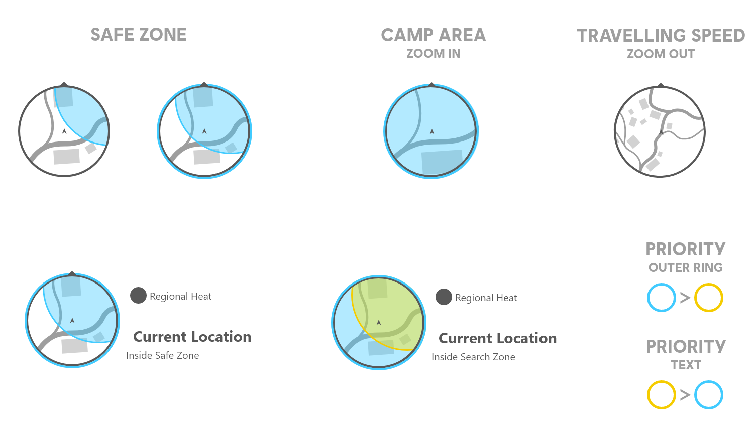
Zones
In-Game Results
HUD Messaging System
Principles
-
Manage Attention: Manage the player's attention and avoid too many notifications going off at the same time.
-
Prioritize: Prioritize more important messages and show them first.
-
Avoid Conflict: Sort messages by location on screen and allow messages in different areas that don't conflict or overlap to show at once.
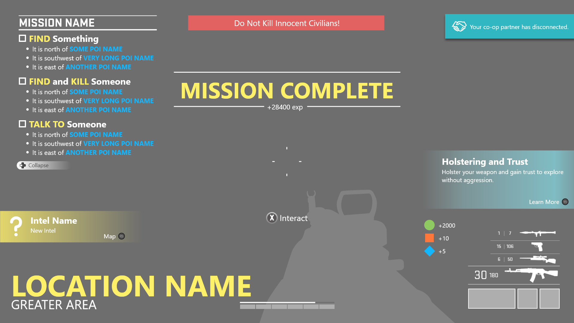
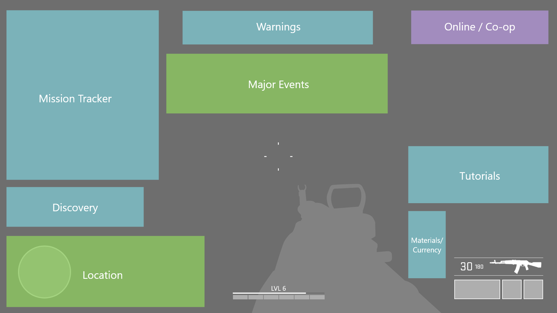
The wireframes above illustrate a screen where all messages are simultaneously visible. However, in the game itself, I've established rules determining which messages can coexist and which must be displayed independently. These rules take into account both the area on the screen where the message appears and the type of message (pertaining to specific gameplay and mechanics). The wireframes merely indicate the placement of each message type on the screen. During gameplay, players will never encounter a scenario where all messages are simultaneously displayed.
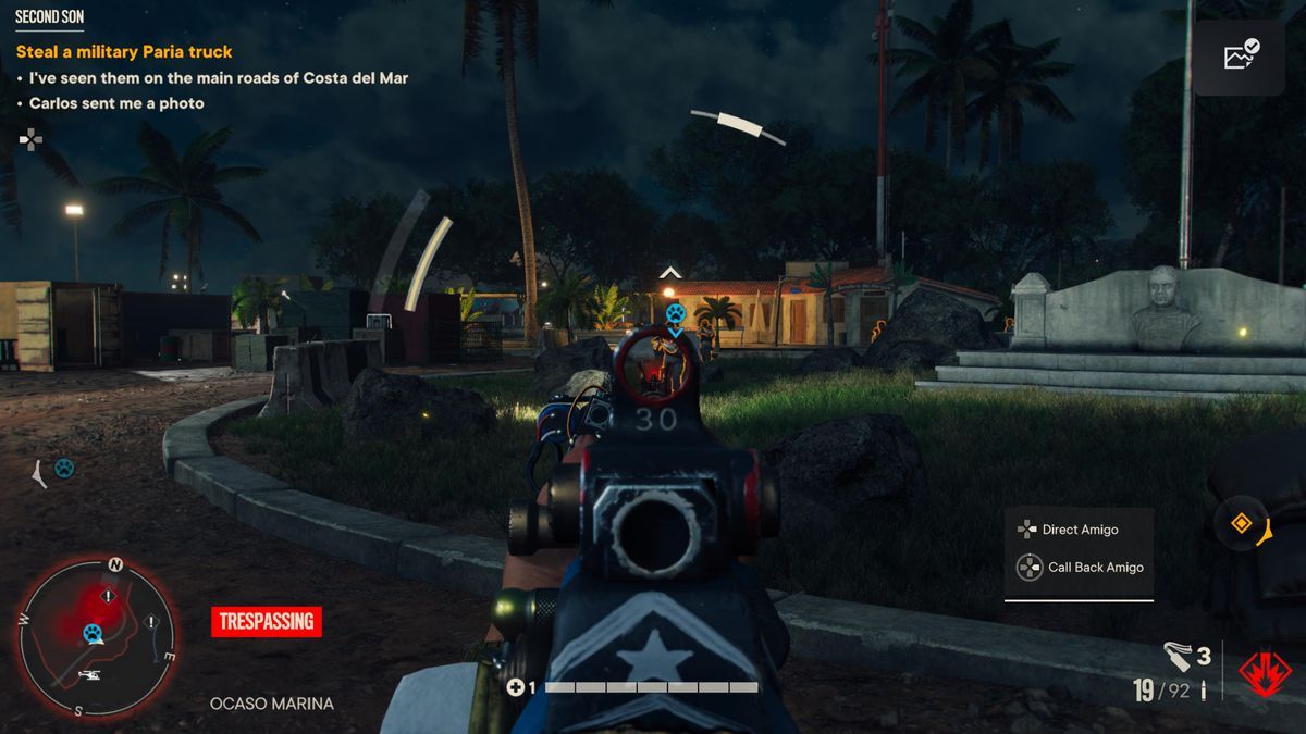
Wireframe Comparisons
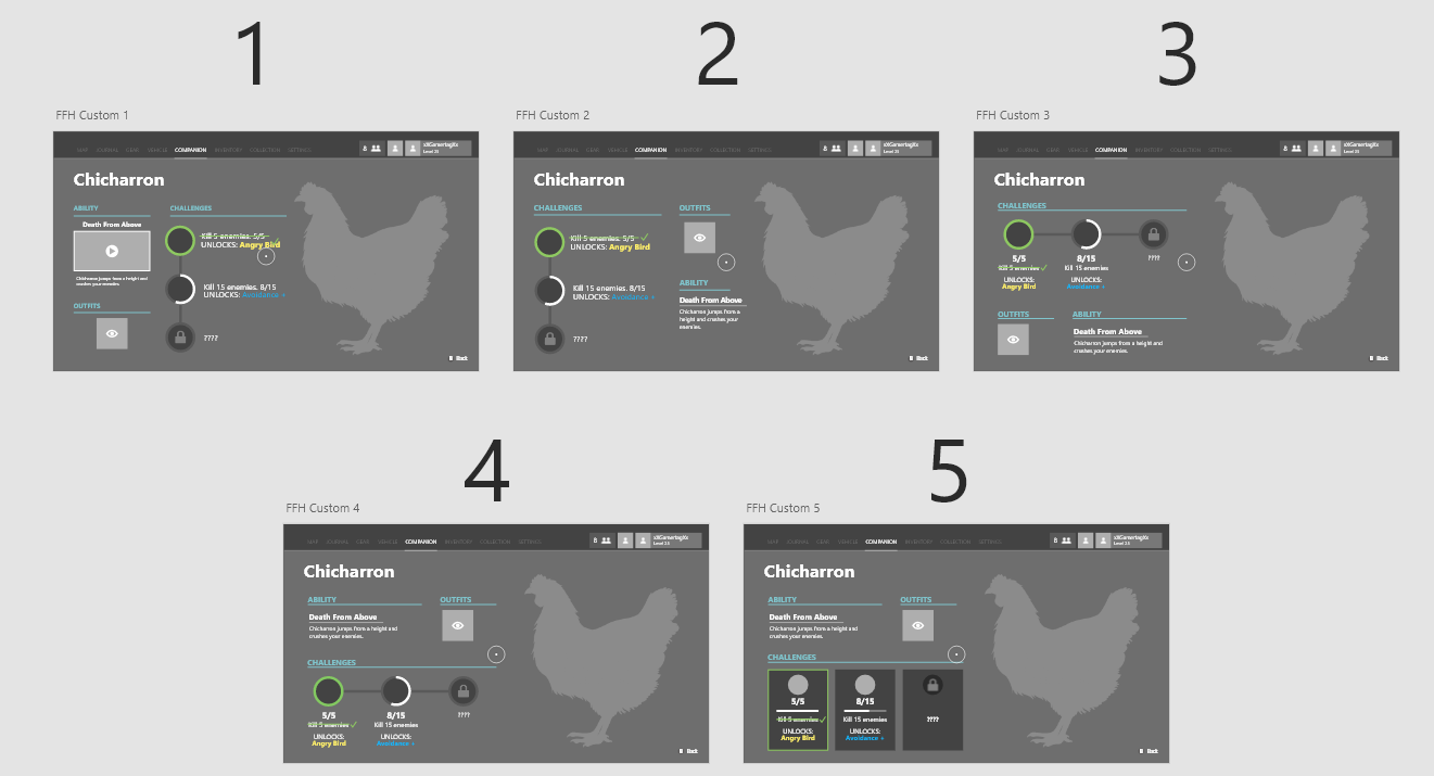
Amigos Menu
Note: Previously known as "Companions" and "Fangs For Hire".
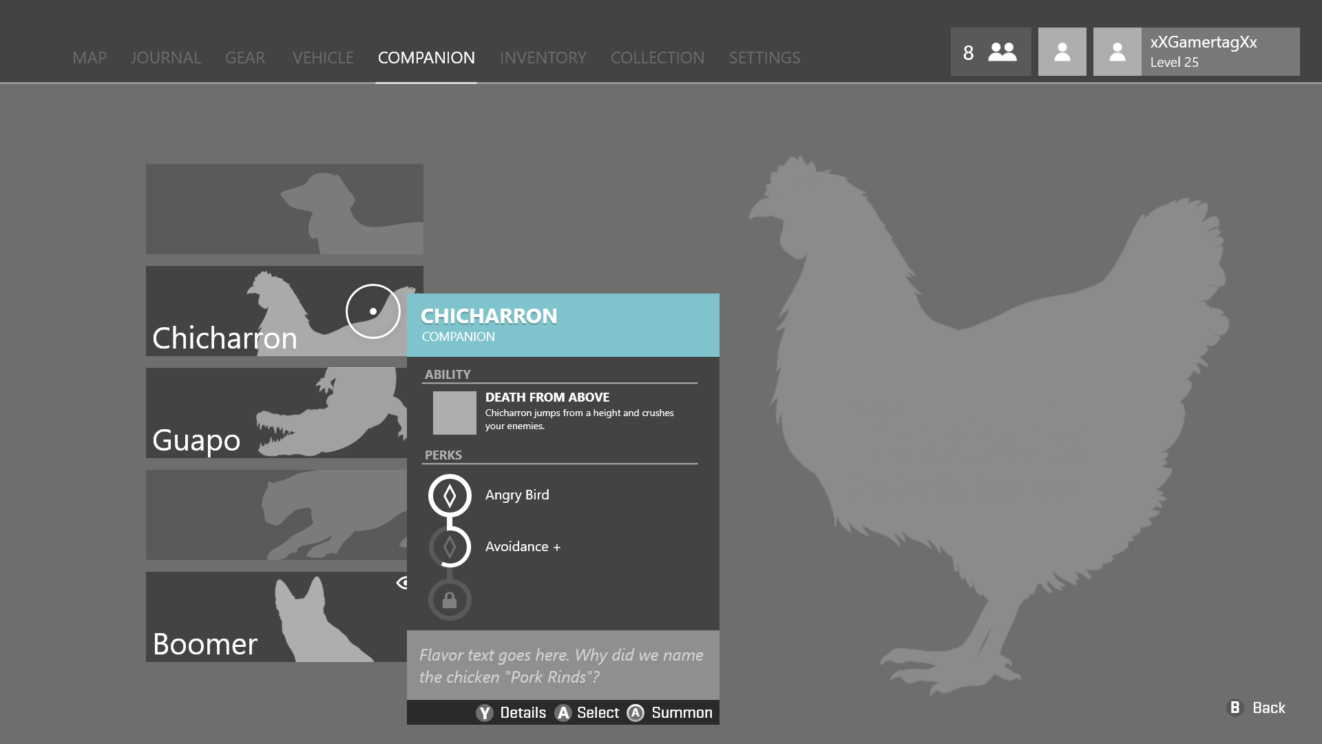
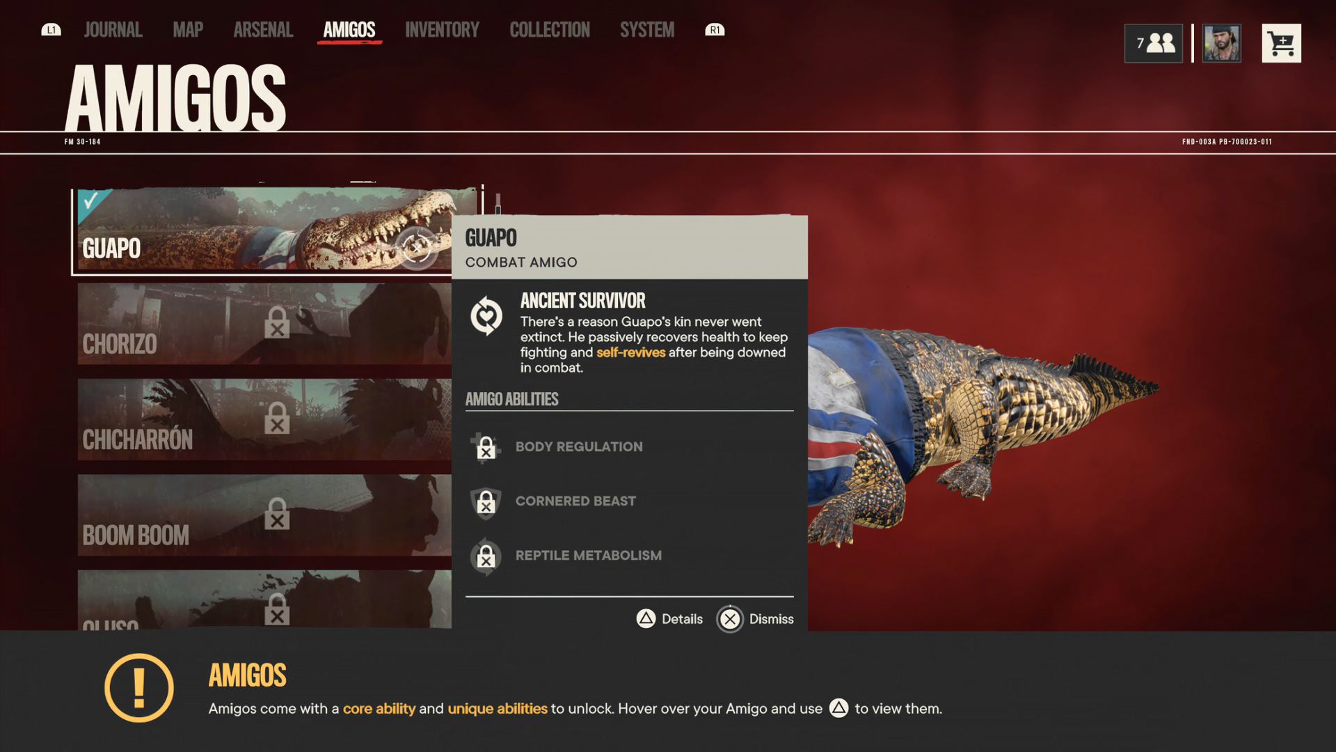
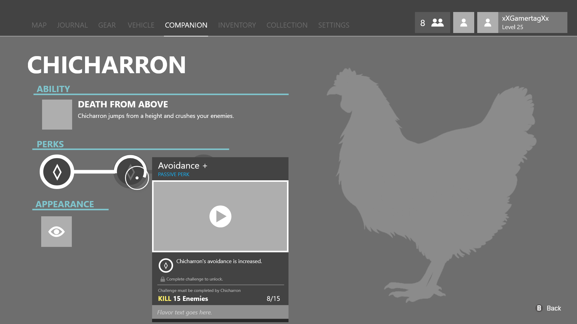
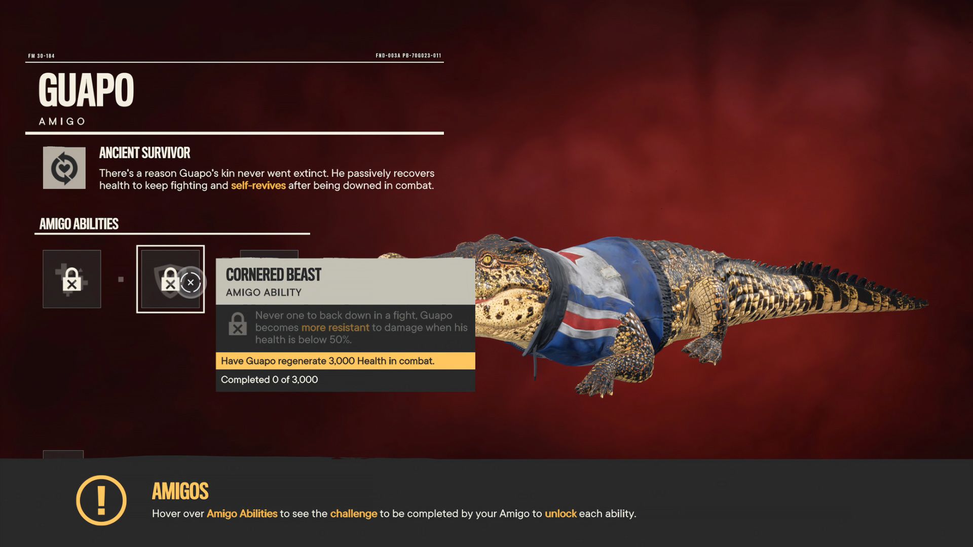
Amigos Menu Ideations
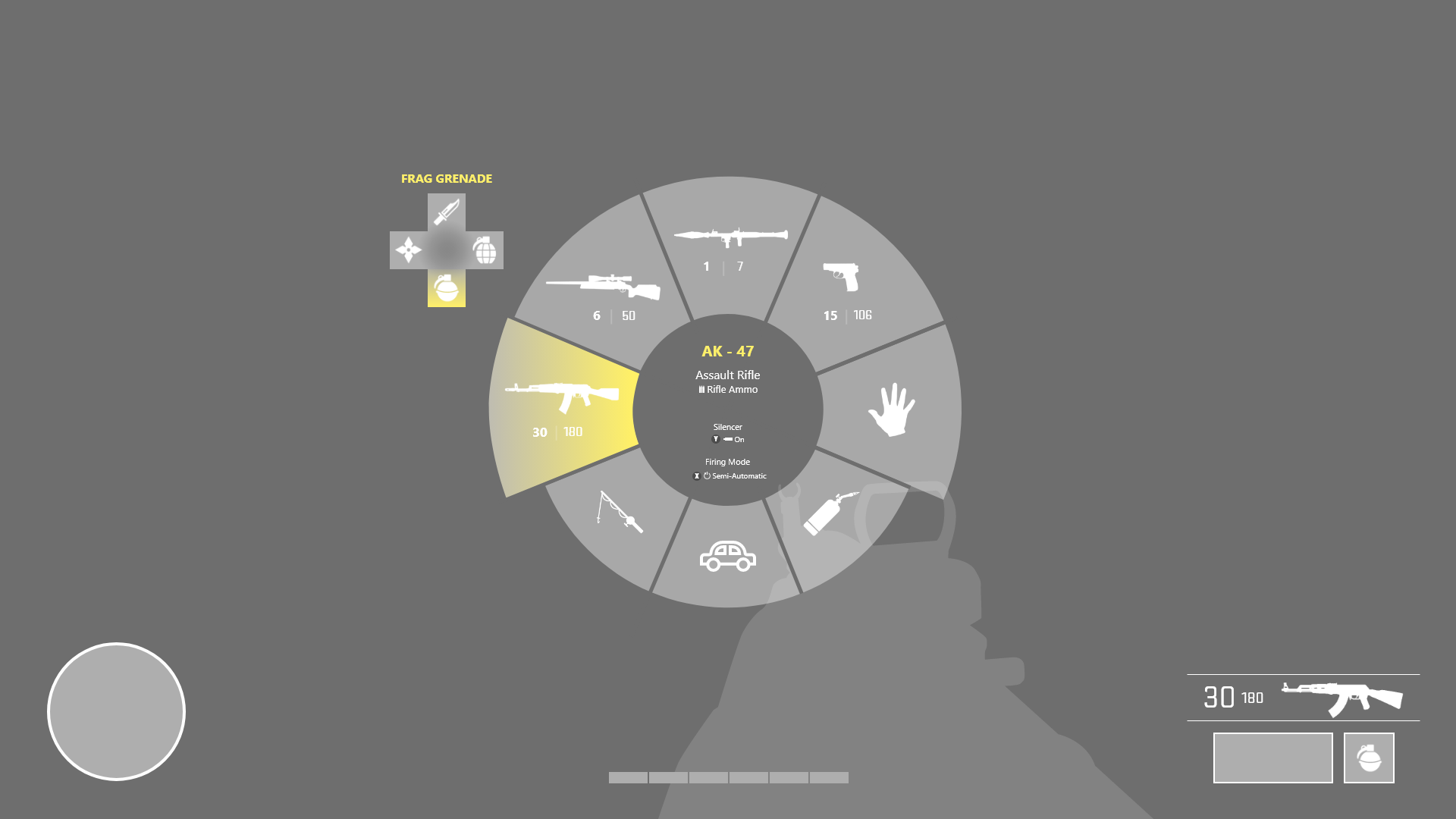
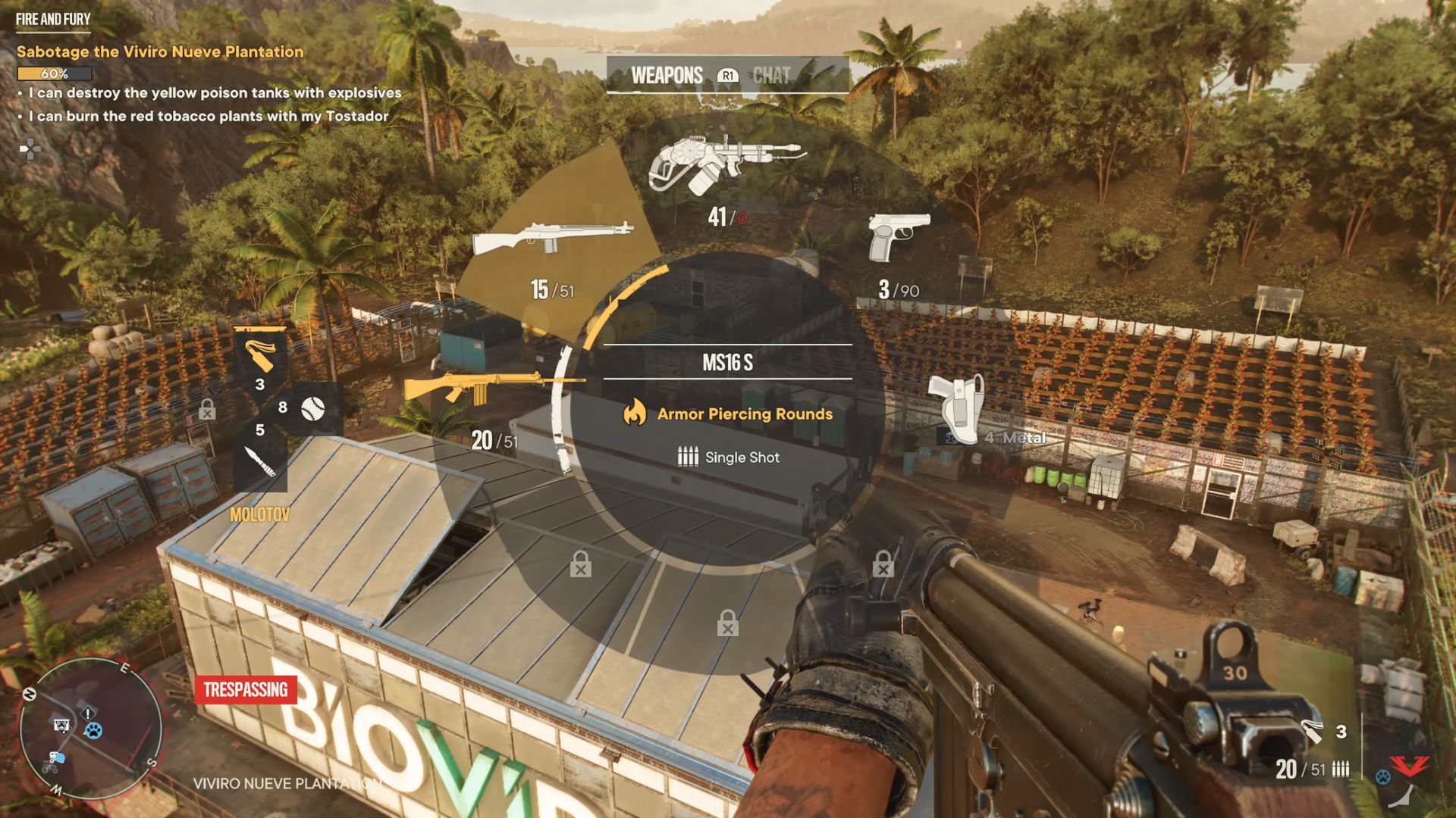
Weapon Wheel
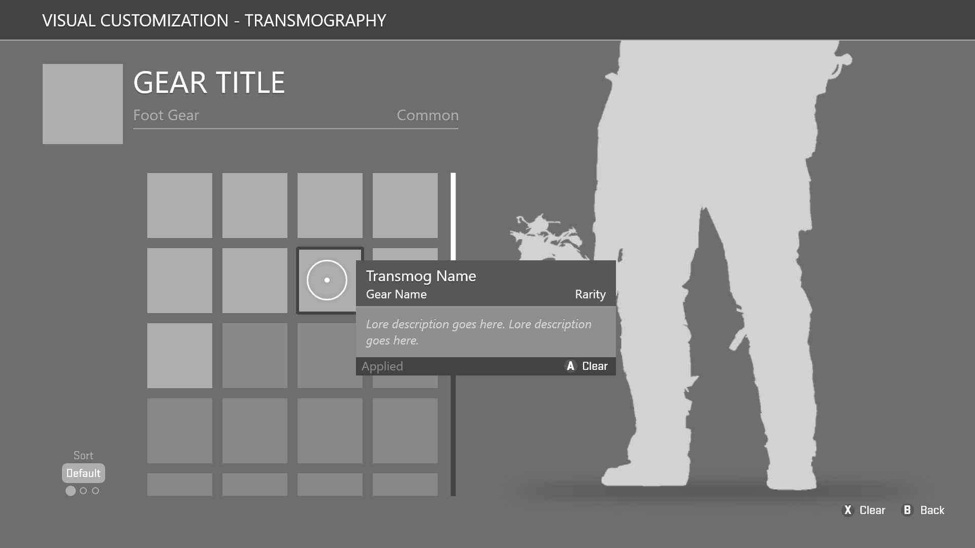
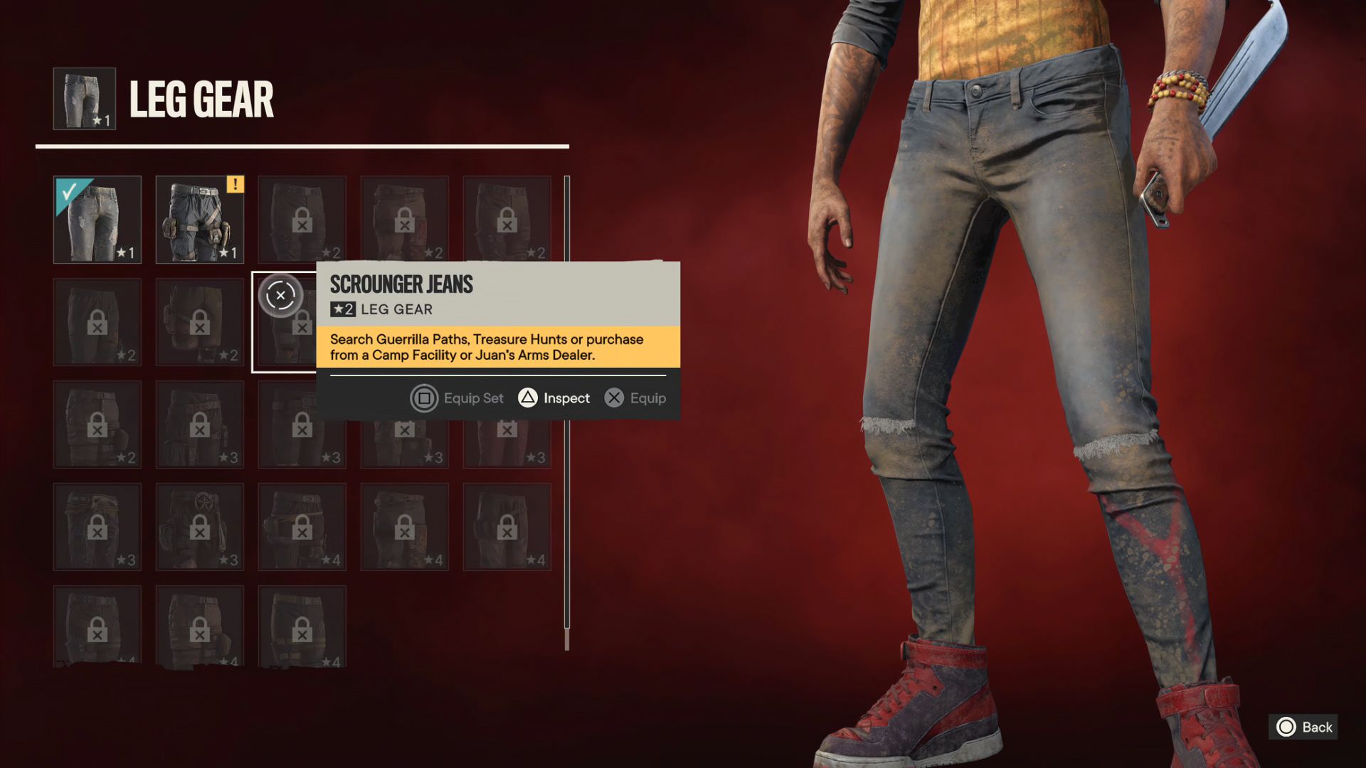
Visual Customization
HUD Discovery and Notifications
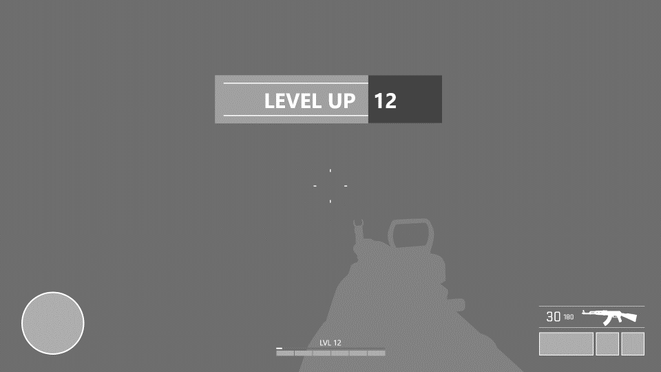
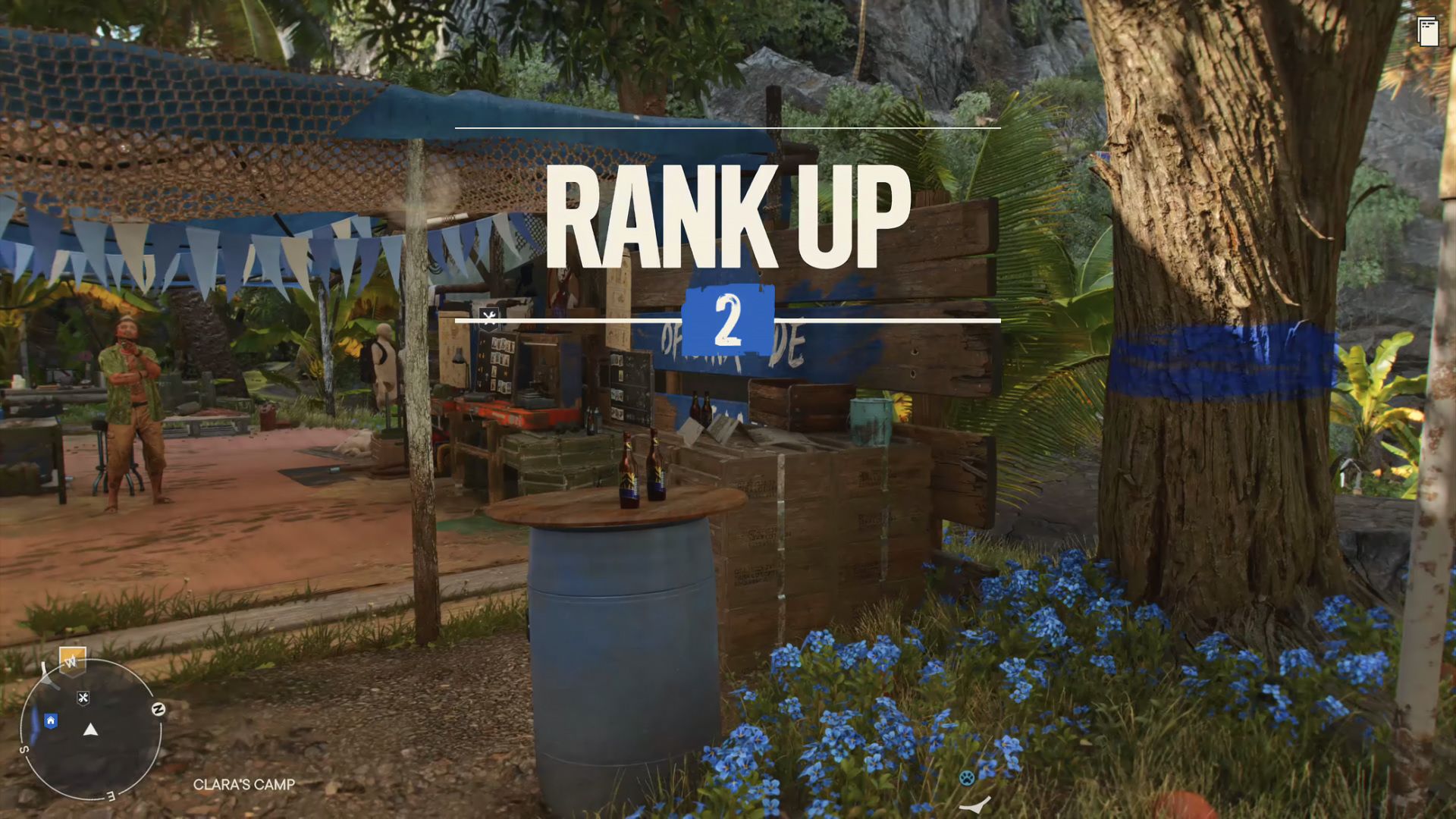
Animations
Hints Update
Weapon Swapping
Note: Weapon Swapping outside of the Weapon Wheel did not make it into the final game.

